

AU VODKA LIMITED v NE10 VODKA LIMITED & LEON HOGAN
Heard by Mr Justice Mellor on 16 September 2022
AU Vodka Ltd v NE10 Vodka Ltd & Anor [2022] EWHC 2371 (Ch) (21 September 2022) (bailii.org)
Article written by Alona Andrieieva, qualified Ukrainian patent and trade mark attorney, now research associate / paralegal at EIP
What is the problem?
The claimant (Au Vodka) applies for an interim injunction against the defendants (NE10 Vodka) to restrain the marketing and sale of their newly launched range of NE10 vodkas. The claim is for passing off, based on the allegedly deceptively similar get-up of the defendants’ vodka to the get-up used by the claimant.
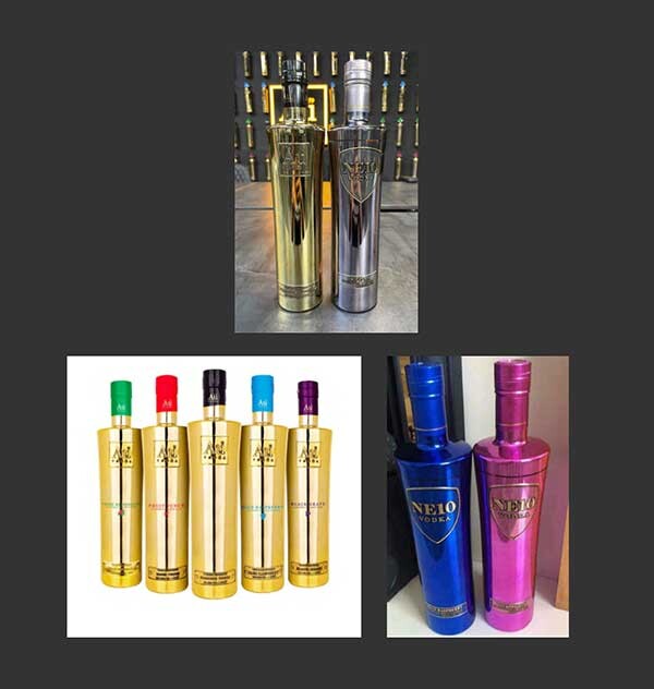
The following images of the rival bottles of vodka provide a fair indication of the issues. The top image shows a bottle of Au Vodka’s plain Au79 Vodka on the left and a bottle of NE10 Vodka’s plain vodka on the right. The image on the bottom left shows Au Vodka’s plain vodka in the centre of the image surrounded by their flavoured vodkas. The image on the bottom right shows two of NE10 Vodka’s flavoured vodkas:
In support of its claim Au Vodka identified the main distinguishing features of the bottle containing plain vodka and they are set out in judgment as follows in paragraph 54:
- “an elongate (meaning tall and thin) bottle having a slight arcuate taper from base to top, a prominent shoulder portion, and a neck of extended length;
- the bottle being metallised, more specifically metallised in the colour gold;
- the bottle being generally of clean appearance, that is to say without further adornment save the upper and lower ‘plates’ particularised below (noting that whilst not prominent in the case of flavoured versions of the vodka that flavour is printed together with a diagrammatic fruit indication about half-way up the bottle);
- an upper plate, close to the top of the bottle comprising a plate surround (a square) within which is the name of the product Au79 in large font and below VODKA in capitalised lower case font;
- a lower plate of secondary prominence, close to the base of the bottle and being of rectangular shape and containing three lines of text all capitalised, “5 TIMES DISTILLED”, “PREMIUM VODKA”, “40% ALC VOL | 70CL e”;
- the term ‘plates’ herein is adopted to refer to the embossed nature of the labels and the text thereon, akin to a boilerplate; and
- The substantial majority of the bottles are of 70 cl capacity although the Claimant also sells miniatures (5 cl) and magnums (150 cl) of identical shape but proportionately scaled.”
Au Vodka pleaded its get-up (above) and contended that the shape of the bottle, namely a prominent shoulder portion, and a neck of extended length, is significant to the consumer's perception of it. Based on the foregoing, Au Vodka also considers it significant that the bottle is metallized in gold and that the presence of upper and lower “plates” that are made in relief is essential.
However the judge stated that the Claimant’s pleading of its get-up focused on their case against the Defendants rather than the features which the consumer will carry in his or her mind, such as:
- “‘the bottle being metallised’
- ‘an upper plate’
- ‘a lower plate of secondary prominence’
- the plates being of ‘an embossed nature.. akin to a boilerplate’.”
The judge goes on to say in paragraph 56 that:
56. “Consumers do not focus on the bottle being metallised, but on the general appearance - the claimant’s bottles are consistently gold in the particular shape. They do not focus on or identify ‘an upper plate’, but rather the content of that label - Au 79 and the descriptor, VODKA. They do not focus on a ‘secondary plate’ but its content - the flavour in particular. They may notice that the two labels are embossed, but very much as a point of detail.”
Therefore, the focus of the consumer remains on the gold bottle of a particular shape and the «Au 79» label with the «VODKA» descriptor. At the same time, this word «VODKA» is descriptive and indicates the type of goods of class 33, alcoholic beverages.
Defendants' bottle of “NE10 vodka” is similar in shape to the bottle of “Au79 vodka”, as seen from the picture (above) showing the parties’ plain vodka bottles side by side.
In paragraph 58 the judge commented on the heavy emphasis by Au Vodka “on the ‘conceptual similarity’ between the claimant’s use of the chemical symbol for gold Au and its atomic number 79 and the defendants’ use of the chemical symbol for Neon: Ne and its atomic number 10” going on to comment “Despite having an interest in chemistry since my school days, I confess that when I first saw the defendants’ bottle and brand name, my immediate impression was that it was perhaps a postcode reference (that thought perhaps an indication of a London bias) and the notion of Neon and its atomic number did not occur to me. The more important point is that this ‘conceptual similarity’ argument has, in my view, nothing to do with what the ordinary consumer thinks when they encounter one of the defendants’ bottles (see further below)”.
The judge's observation may indeed be interesting for us, since the combination "NE10" is not as popular and famous as "Au79". And besides, it was interesting that the judge pointed out that at first glance this could indicate a postal code.
The judge, acknowledging that he was straying into mini-trial territory, considered the social media posts provided by Au Vodka as evidence in support of its argument that consumers would be deceived about the origin of the vodka marketed by NE10. The judge was not convinced. Consider paragraph 71:
71. “Doing the best I can on the evidence, viewed in context, it seems to me that none of these people were actually deceived into thinking the defendants’ vodka was that of the claimant. At most, one might say that these instances support a case that consumers will believe the defendants’ vodka comes from the same stable as the claimant (cf indirect confusion in the law of registered trade marks), but, to my mind, what they evidence is consumers wondering whether there is a connection as opposed to actually believing that there is one. So these are not, in my judgment on the current evidence, instances of actual deception.”
Au Vodka believe that the use of a name chemical element and atomic number in the name of the vodka is also a copy of their reputation.
Based on the images in evidence, the judge finds at paragraph 73 that consumers “will notice the distinct similarity in the shape and dimensions of the bottles and perhaps some of the other similarities relied upon by the claimant, but, in my view, those are likely to be outweighed by the different name 'NE10' as opposed to 'Au' and the fact that none of the defendants' bottles are gold”.
In addition, the judge declined to reach any conclusions as to the Defendants intention in selecting its name and get-up and in paragraph 79 said:
“It is too early to draw any such conclusion in this case …At the same time, I decline to take into account the claimant’s accusation that the defendants intended to trade off the claimant’s reputation and goodwill”.
The judge’s ruling
The judge declined to order an interim injunction but ordered an early trial to be held in January 2023.
Commentary on surrounding facts
It will be interesting to see what happens at trial and what evidence is brought then in support of distinctiveness of the Au Vodka bottle.
In this respect it should be noted that the shape of the claimant’s (Au Vodka) bottle does not appear to be original nor distinctive. Similarly shaped bottles have long been used. Also the use of a metallized bottle made in gold colour is not original or distinctive for a bottle of vodka.
Examples of bottles with a similar shape and gold bottles which have long been widely used by other manufacturers and there are examples to be found by a quick internet search as well among registered trade marks in various countries.
 [1]
[1]
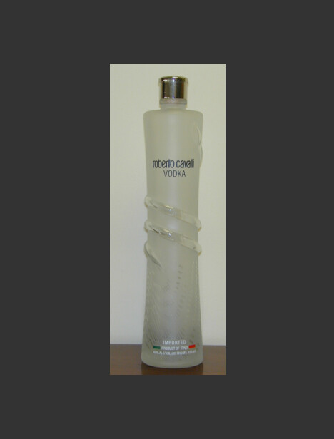
For example, the shape of the AU 79 Vodka bottle is similar to the shape of the ROBERTO CAVALLI SPA vodka bottle, which is protected as a trade mark US 78628438 (priority from 05/12/2005). These bottles have even been produced in gold colour and metallized as shown here.
Another similar vodka bottle named Grand79 has a metalized bottle in gold colour and the first picture was posted on 20 June 2016: Grand79 Vodka | Facebook.
Other gold vodka bottles include Vallure Vodka and famously Trump Vodka, launched in the United States in 2005. Brands such as JJ Whitley even combine a gold metallized bottle with a similar shape of the neck and shoulders or an elongated body.
There are also registrations of trademarks for class 33 goods (alcoholic goods, including vodka) which include the atomic number and/or the two-letter designation of the name of the chemical element "gold". And the word "gold" itself was widely used earlier by other manufacturers in various parts of the world. For example Grand 79 has trade marked its device (below) which includes the number 79. Other examples are also shown below:
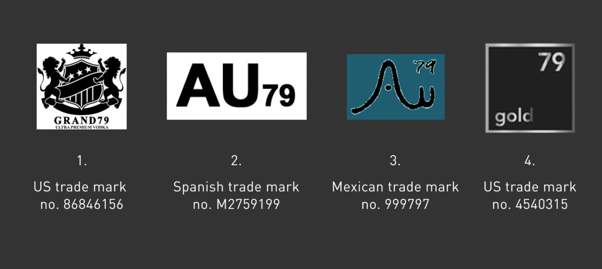
In addition there are word marks for “verus AU79” (German trade mark no. 302009039886) and “Au79” (French trade mark no. 3809851).
So, the above examples show that:
- the shape of the bottle being at the same time made of metallized gold colour, and
- use of atomic number 79, and "Au" indicating gold (whilst at the same time, the execution of the bottle in metallized gold colour enhances this association to the consumer)
is quite common for vodka.
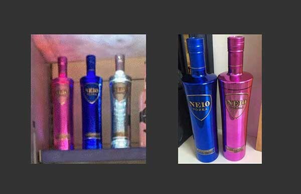
In contrast the pictures below, shown in the judge's decision, appear to me to show the originality of the colour for the "HE 10" vodka bottles, which can lead to an association with neon because of its bright, commonly used colours that are not of natural origin.
Conclusion
There are significant differences between the colour of the metallization, the label (including its shape and the writing on it) between the two bottles. And many of the features have been used by others before.
In my view, a customer might remember the colour, especially if it is very unusual, the bottle but it is the name that it is most important.
In the recent EU IPO Board of Appeal decision referred to in the judgment (R 1839/2021-5) the fifth board of appeal commented “The most commonly used colours on vodka bottles are white, blue and silver and transparent, symbolising coldness. Most vodka bottles are also cylinder shaped, while only some of them feature a relatively short narrow neck”.
Customers might remember a very usual colour, such as the pink above, but as I have shown above gold is not so unusual.
I think that for a vodka consumer there is a lower focus (attention) on the shape of bottle and the colour of bottle when they are buying a vodka, compared to the focus (attention)on the shape and colour when the buying something like an expensive car or an expensive watch. For the consumers of vodka is most important thing what is inside the bottle and the name of the vodka.
We will be able to see what evidence is brought and the decision of the judge after the trial in January 2023.
[1] Image from USPTO file for US trademark 78628438